Stellr Web
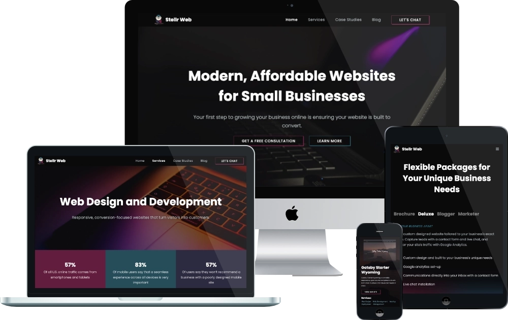
For my small business-focused portfolio, I developed a responsive website and blog that delivers a compelling user experience. Custom animations provide a modern touch and enhances the presentation of dynamic content. With a scalable headless CMS, content management is efficient and straightforward.
the motivation
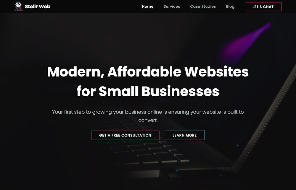
Build a Fast, Modern Marketing Website
I needed a website to market my web development services to small businesses. It needed to have a sleek, modern design that was mobile responsive. I wanted to integrate page generation for a blog and case studies.
the solution
A Hand-Crafted Site with a Blog and Case Studies
I chose Gatsby to build my site since I needed to generate both blog and case study pages. The site is styled using SCSS modules and animated with custom Framer Motion animations.
The Process
The original Stellr website was styled with global SCSS. On the redesign, I transitioned to modules for better component scoping. I redesigned the site from the ground up and implemented a more modern, dark theme.
I needed two types of animations - aesthetic and functional. The on-reveal fade and zoom animations keep the site visually interesting, while the custom services slider and case study hover effects allow me to organize and display information more effectively.
The content for the blog and case study pages is kept on Prismic, a headless CMS and generated on build. Each case study features and gallery section lazy loaded using Gatsby's image plugin and an embedded Youtube video.
The contact form is connected to Netlify forms so each submission lands directly into my inbox.
- Update my original Gatsby site to the newest version
- Swap global SCSS for SCSS modules
- Completely redesign the existing site
- Connect the site to the headless CMS
- Build custom Framer Motion animations and integrate them into the site
- Hook up the contact form to Netlify's form service
The Challenges
I needed to create multiple complex animations from scratch using the Framer Motion library. I had to ensure they were mobile friendly and accessible to people who prefer reduced motion.
To build my case study templates, I needed to plan what type of information I was going to provide and the best way to structure it. I used multiple markdown and image fields so I could display the info in a more logical and visually appealing way.
Let's Connect
I am always open to connecting with like-minded individuals in the tech community. Whether you have questions about my work or simply want to connect and network, feel free to reach out to me.
I look forward to exploring new opportunities, sharing ideas, and growing my professional network, and I would be happy to hear from you!